Supporting caregivers throughout the cancer journey
Context
My experience with cancer care in Alberta began in 2015 when my Father received a late-stage prostate cancer diagnosis. The cancer quickly spread throughout his body and by the end of the year he was admitted to the palliative care unit of the Foothills Hospital where he would remain for nearly 3 months before returning home in early 2016. During the time we spent in the hospital, my family and I became intimately acquainted with the experience of patients battling cancer and the families and caregivers who support them.
In 2019 I chose to revisit the topic of cancer care in Alberta as part of my involvement in a virtual design sprint school hosted by D4AHS, the design lab housed within Alberta Health Services, the provincial. Each participant was invited to work through the lab’s design sprint process by identifying a topic that could be explored through a design sprint. I came to this opportunity with my own experience and ideas regarding steps that could be taken to improve cancer care, quickly realizing the complex nature of delivering quality care to patients at a vulnerable and challenging time in their lives.
Role
Through the work of my private family foundation I provide small grants to find pilot programs with the potential to catalyze transformative change in an organization’s overall service delivery. In 2016 the foundation funded a music therapy pilot project in the same palliative care ward where my father had been a patient.
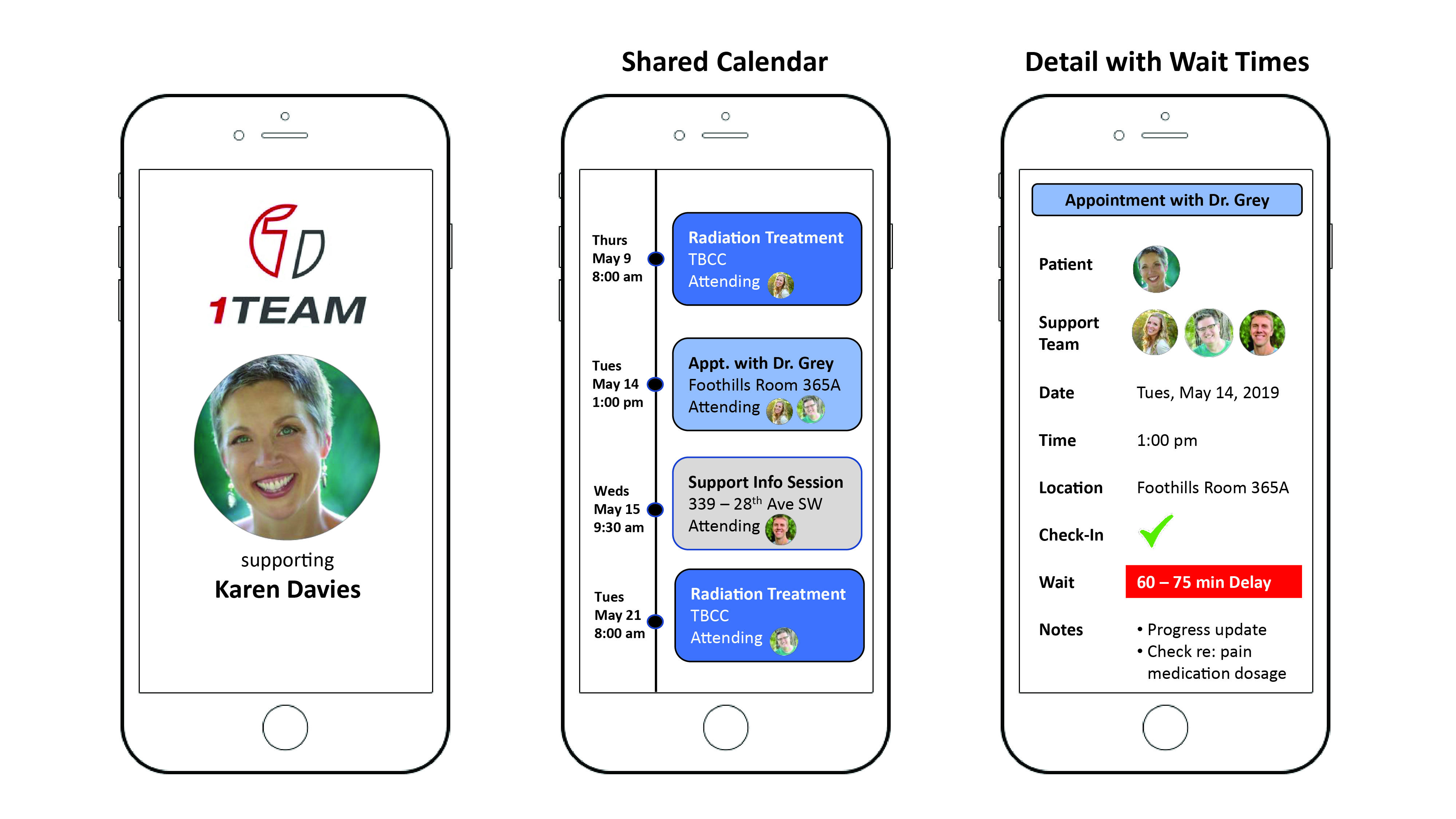
Through my participation in the design sprints school I approached the subject of cancer care with the intent to understand the experience of caregivers supporting loved ones battling cancer with the intention of exploring the topic further through a design sprint. I served as lead developer for the research and design of a prototype titled 1 Team, a mobile application that serves as a one-stop-shop for the patient, their caregivers, medical staff and other stakeholders to collect and organize relevant information in a simple and accessible format based on feedback from a broad range of users.

Process
The first section of the six week program focused on properly framing the problem. Ariel Sim, Director of Design Anthropology at MaRS Innovation District and one of the guest lecturers prompted me to more thoroughly consider the role of the service providers (Doctors, Nurses and support Staff) involved in the delivery of cancer care as I considered the parameters for a design sprint. As a result, the problem statement was iterated several times, ultimately resulting in the question: How Might We make navigating available cancer treatment options less ambiguous and emotionally-draining for newly-diagnosed patients, their families and support systems
With this refreshed problem statement as a guide I began reaching out to cancer patients and their caregivers, seeking a broad user group based on gender, age and type of cancer. Initial research was focused mainly on user interviews in order to allow participants to detail their initial reaction to their cancer diagnosis and how it affected their daily lives. Once patients had provided their story, I consulted with their caregivers to understand their perspective and the various touch points in which they interacted both with their loved ones and the existing health care system.
Follow-up interviews enabled me to create a detailed user journey map for each research participant for feedback, with a strong focus on their emotional experience throughout the journey. Doing so allowed us to focus on major pain points which could be addressed in the pilot phase.
In Action
As described in the video above, initial problem framing focused on empowering cancer patients and their families to have greater input in determining their course of treatment. Subsequent user research determined this was not a major pain point. Simple administrative functions, such as maintaining an up-to-date calendar and having a better understanding of wait times, were identified as more pressing issues and were prioritized in the design of initial prototypes for testing.
Outcomes
- As we learned during initial user interviews, line of sight to wait times was a key pain point which had not been addressed, therefore, the wait time indicator included in the appointment detail page was seen to provide strong utility and ease of use. Several users suggested that this functionality be extended further through the use of SMS text alerts to provide advanced notice to patients and caregivers of any changes to their appointment timings.
- The shared calendar was considered one of the most useful features by users, however, some expressed a desire to have appointments confirmed by the hospital to ensure the dates and times remained up to date. This type of verification by service providers was also seen as an example of the value of a “one team” approach to ensuring the best possible care for cancer patients by aligning supporters around a central mission: ensuring best possible care for patients during a challenging and vulnerable time in their lives.
- Having resources centralized within the app was also considered to be an important feature, with many users seeing it as a hub for a variety of related services which can be difficult to keep track of given the different organizations providing them, many of whom rely on volunteers and have limited communication channels. By centralizing the information in one place users felt they could better track applications for financial assistance as well as support services available to their loved ones.
- While users acknowledged the rationale behind having a group chat window embedded within the app, most stated they would be unlikely to use it in place of existing group chats on iMessage or WhatsApp. It simply did not deliver additional utility and could actually lead to unnecessary duplication.
- Additional user needs were also identified, including the option to store and share notes within the app as well as saving data related to the patient’s unique medical needs and preferences in order to streamline communication across different service providers and facilities.


1 Team is a mobile application prototype developed in close collaboration with cancer patients and their caregivers. Subsequent feedback has been incorporated into the latest prototype which has been presented to the innovation department of Alberta Health Services for additional consideration.


